
Windows' Icon Evolution - A Look at the Taskbar

Windows’ Icon Evolution - A Look at the Taskbar
The taskbar is a cornerstone user interface feature of Windows. That bar along the bottom of the Windows desktop includes your active minimized/maximized program windows, the Start button, the System Tray area, pinned shortcuts, and the clock. It enables you to multitask by switching between minimized program windows.
The taskbar has been a part and parcel of Windows for more than 25 years, and over that time period, Microsoft has added and removed features to and from the taskbar. This is the history of the Windows taskbar from its inception up to 2023.
The Early Days of Windows: Before the Taskbar
The taskbar did not exist in the early Windows 1.0, 2.0, and 3.0 platforms released from 1985-1992.
However, Windows 1.0 and 2.0 did include a bar on which users could minimize multiple running programs by double-clicking their title bars. Each program on that bar had an icon to click on, a bit more like the taskbar from Windows 7 onward. That bar can be considered the forerunner to the Windows taskbar.
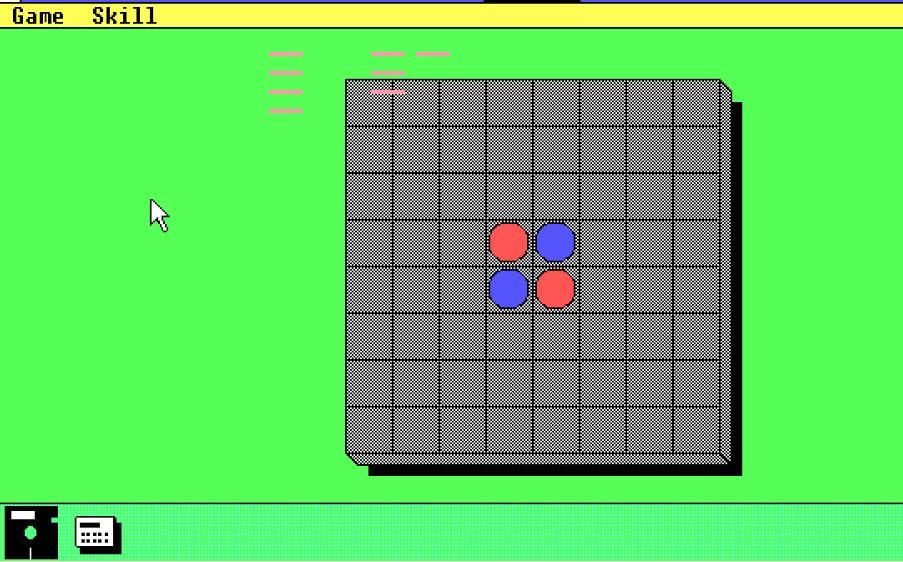
However, it didn’t include a Start menu or system tray area and wasn’t even present in Windows 3.0. Program windows minimized to the desktop background area in Windows 3.0.
Windows 95: The Introduction of the Taskbar
Daniel Oran, a former Microsoft interface designer, is credited with inventing the taskbar and Start menu in 1993. He suggested Microsoft add a Start menu button to Windows 95 that users could access from a new taskbar. This would make it easier to access everything from a central system menu.
The Redmond giant unveiled Windows 95 in 1995 with a “Start Me Up” Rolling Stones launch jamboree that introduced the new Start menu and taskbar.
The first true taskbar in Windows 95 laid the foundations for the future with a Start button, system tray area, and permanent clock. However, it was still somewhat different from the Windows 10 and 11 taskbars most users are familiar with today. Windows 95’s taskbar was grey and had rectangular minimized windows with program title labels.
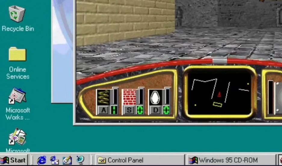
The original Windows 95 version didn’t have a Quick Launch area. However, a Quick Launch area was on later versions of that OS. This was an area of the taskbar on which users could add program shortcuts. It also included a Show Desktop button and Internet Explorer icon.
Some third-party software packages enable you to restore the classic Windows 95 taskbar in Windows 11/10. For example, you can revive the Windows 95 and XP taskbar with the RetroBar app.
Windows XP: A Revamped Taskbar Appears
Microsoft gave Windows XP a new visual style and redesigned the taskbar to match it. Windows XP’s taskbar had a default blue color scheme with a green Start button, which was quite a departure from the gray taskbars of Windows 95, 98, and Millennium. Minimized taskbar windows also had more rounded corners to match the rest of the new-look design.
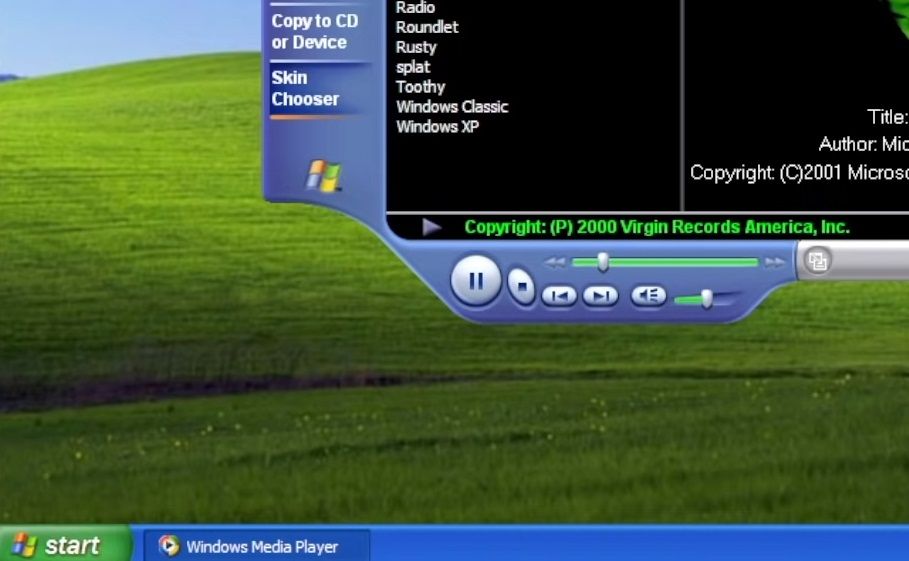
Windows XP’s taskbar was the first to have grouped windows. This feature enabled the grouping of multiple open windows from the same application on the taskbar. Users could click to view different windows from the same taskbar app windows.
Windows Vista: The Introduction of Window Previews
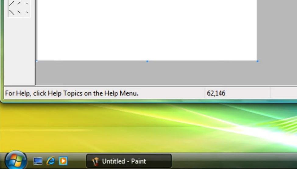
Vista didn’t go down a storm with new users during its 2007 release year. However, its taskbar did have one welcome new feature that’s remained a part of Windows ever since. Vista’s new taskbar thumbnails enabled users to view small previews of a window’s contents by hovering their cursors over its taskbar icon.
Windows Vista’s taskbar was also the first to include a Start button with no label text. Instead, it was just a circulator button with a Windows logo. The removal of the “Start” label reduced the button’s width and freed up a bit more taskbar space.
Windows 7: Another Taskbar Overhaul From Microsoft
Microsoft gave the taskbar one of the biggest overhauls in its history for Windows 7. The most notable change was that minimized apps on Windows 7’s taskbar did not include labels, but users could still clearly identify them with their expanded icons. This significantly reduced the width of taskbar app windows.
For the first time, users could pin shortcuts on a taskbar in Windows 7. This effectively made the Quick Launch area redundant, which Microsoft removed from the taskbar. Three pinned Windows Explorer, Media Player, and Internet Explorer taskbar shortcuts filled the void.
The Windows 7 taskbar also introduced a new Jump List feature. This feature enabled users to access recently opened files or webpages for an app minimized to the taskbar from its window’s Jump List menu. Users could also pin files or webpages to Jump Lists for regular access.
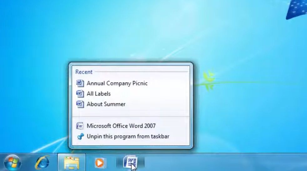
Microsoft also swapped the Show Desktop button from the Quick Launch area with an Aero Peek alternative at the far right of the taskbar. Clicking the Aero Peek button minimizes all windows to the taskbar. Hovering the cursor over that button enables users to view the desktop area without minimizing anything.
Windows 8: The Start Button Goes Missing From the Taskbar
The taskbar didn’t change much in Windows 8. However, it was the first taskbar in Windows history not to include a Start button. The Start screen replaced the Start menu in Windows 8. So, a taskbar Start button for accessing a menu was seemingly no longer required.
However, the removal of the taskbar’s Start button generally didn’t go down well with users. Microsoft later released a Windows 8.1 upgrade that restored a new-style taskbar Start button for accessing the Start screen. That wasn’t enough to save Windows 8 though, and the OS never recovered.
Windows 10: The Introduction of New Taskbar Icons
Microsoft added buttons for new features to Windows 10’s taskbar. The Windows Cortana virtual assistant was originally tied to the Windows Search tool. However, Microsoft separated the search tool from Cortana in later Windows 10 versions.
Consequently, Windows 10’s taskbar became the first to include a Type here to search (magnifying glass) button on it for accessing the search box, which isn’t available through the Start menu.
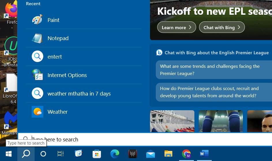
Task View was another notable new Windows 10 taskbar feature. Clicking the Task View taskbar button brings up virtual desktop options. You can also access file and Edge webpage shortcuts from Task View’s timeline.
Windows 11: The Taskbar Goes Central
Microsoft released Windows 11 in 2021, and the first new thing most users noticed was the centralized taskbar icons.
Windows 11’s taskbar was the first to have center-aligned icons in the middle by default. This makes that taskbar a bit more like the macOS Dock with its centralized icons. However, you can always add a macOS-style Dock to Windows 10 & 11 if you prefer.
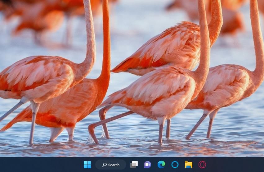
Microsoft also added a new Widgets button to Windows 11’s taskbar. The Widgets Board is one of the biggest new features in Windows 11 on which you can pin weather, sport, Game Pass, traffic, entertainment, and other widgets that provide info and content. The Widgets feature also displays a weather icon and description on the taskbar.
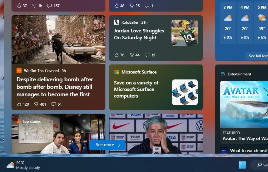
However, many users have complained about the features omitted from Windows 11’s taskbar. Microsoft removed the taskbar’s repositing and resizing functionality in Windows 11. Nor can you pin icons to the taskbar by dragging and dropping them onto it as you can in Windows 10.
The taskbar’s right-click menu has been considerably trimmed down in Microsoft’s latest desktop OS, leaving it without many options previously available.
Where Would Windows Be Without Its Taskbar?
It’s hard to imagine what Windows would be like without the taskbar, which in some respects is even more important than the Start menu. The introduction of the taskbar and its connected Start menu in 1995 transformed the Windows OS. It has been the always-visible user interface feature of Windows ever since for software multitasking, accessing important OS features and apps, and checking the date and time.
The taskbar has been a part and parcel of Windows for more than 25 years, and over that time period, Microsoft has added and removed features to and from the taskbar. This is the history of the Windows taskbar from its inception up to 2023.
Also read:
- [New] In 2024, Srgb Efficiency Against Basic Rgb
- [Updated] In 2024, Mastering the Marketplace 30 Advanced FB Techniques Explored
- [Updated] Picturing Laughter Building Memes with Text Tool for 2024
- Apple's Next-Gen Marvel: IPhone 15 Pro Vs. Pro Max Showdown
- In 2024, 5 Hassle-Free Solutions to Fake Location on Find My Friends Of Infinix Smart 8 HD | Dr.fone
- Optimize User Interface: Manage Filter Key Options in Windows
- Reviving Input Devices After Sleep on Win11
- Step-by-Step Troubleshooting for Overcoming 'Error Code 103003' In Tarkov
- System Resuscitation: Modernizing Windows Driver Technology
- Understanding HuggingChat - An Insight Into the Accessible, Community Supported Option Against ChatGPT
- Unleash Power: Top 10 Must-Have MSIStore Picks
- Title: Windows' Icon Evolution - A Look at the Taskbar
- Author: Joseph
- Created at : 2024-10-04 16:55:00
- Updated at : 2024-10-07 01:35:02
- Link: https://windows11.techidaily.com/windows-icon-evolution-a-look-at-the-taskbar/
- License: This work is licensed under CC BY-NC-SA 4.0.