Windows 11'S Updated Start Menu: Navigating the Latest Grid-Based Design Changes

Windows 11’S Updated Start Menu: Navigating the Latest Grid-Based Design Changes
While there’s a lot to love about the Windows 11 Start Menu, the way Microsoft shows a vertical list of “all apps” isn’t ideal. However, the company is finally testing a new way to show apps in the Start Menu, with an expanded grid view in the latest beta build.
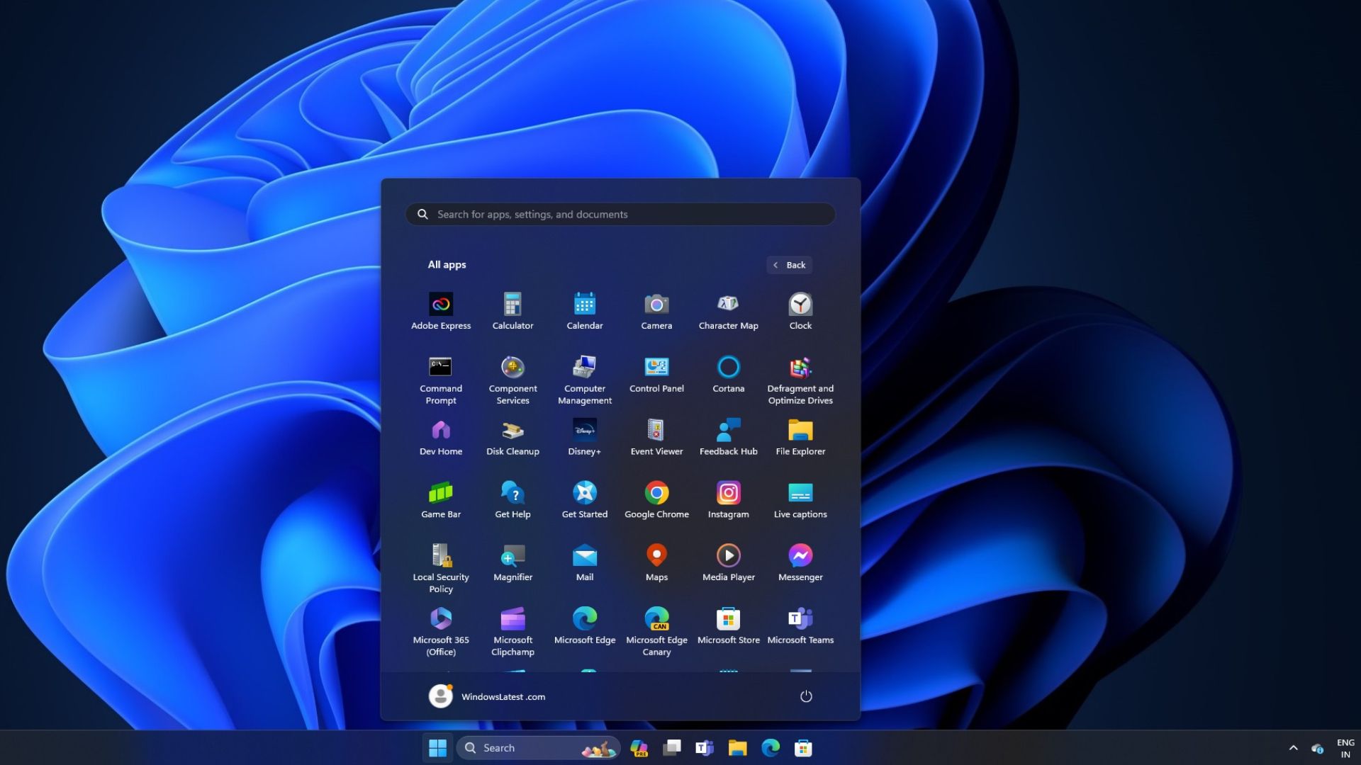
First spotted by several people on Reddit in the latest beta Build 22635.3420, Microsoft is experimenting with an option for Windows 11 users to show all apps in a convenient “Grid View,” which some may prefer. There are plenty of helpful features in the Start Menu , and this could eventually be one more option for users.
When you open the Windows 11 Start Menu and see your list of pinned apps, then tap “All Apps” near the top right of the Start Menu, it opens a massive, vertically scrolling list of all the apps. And while that interface is clean and easy to see, there’s a lot of scrolling involved to get to apps further down the alphabet. Sure, you can tap the first letter of any app on the keyboard to quickly jump down the list, but the new grid view being tested makes things even more accessible.

As shown above from the latest beta, once a user selects the all apps option, the Windows 11 Start Menu expands into something similar to the Microsoft Launcher on Android. From here, you’ll see larger and easier-to-find app icons in a 6x6 grid layout.
All your Windows applications are still listed alphabetically, but seeing over 30 apps in the start menu at once is certainly handy. Then, you’ll be able to continue scrolling to view the rest. As you can imagine, this makes better use of all the screen real estate, but it’s also a big change from what we’re used to dealing with.
If Microsoft ends up delivering this new interface for the Start Menu and apps, we’re hopeful there’s a way for users to toggle between either option. That way, only those who’d like the change can take advantage of it. Microsoft is still testing this layout, meaning it could change or never arrive at all. We’ll have to wait and see.
Source: Windows Latest
Also read:
- [Updated] Your Portal Into Creation Easy Metaverse Personas
- CatchEmAll Celebrate National Pokémon Day with Virtual Location On Apple iPhone 15 Pro Max | Dr.fone
- Discover Amazon's Economical Soundbar for High-Quality Listening
- Easing Up Microsoft Store Accessibility in Windows 11
- FineReader PDF - iPhoneやAndroidのスマートフォンで簡単に文書をスキャンする方法
- Getting the Pokemon Go GPS Signal Not Found 11 Error in Meizu 21 Pro | Dr.fone
- Grau GmbH's Ultimate Video Fixer: Comprehensive Hardware and Software Tools
- Incidence Rate of Combustion in Battery-Powered Autos: A Closer Look
- Making Your Files Automatically Accessible in Win11
- Mending Disabled Trash Can Symbol on Win11 OS
- Strategies to Stop VMware Blue Screen in Win11
- Techniques to Prolong Windows 10 Closure with Ongoing Processes
- Troubleshooting Required Items Not Met in Win11/Win11
- Windows 11 Meets Virtual Box 7.0: A Detailed Guide for the Tech-Savvy
- Windows 11: Reclaiming Precise Search Functionality
- Title: Windows 11'S Updated Start Menu: Navigating the Latest Grid-Based Design Changes
- Author: Joseph
- Created at : 2024-10-28 16:58:13
- Updated at : 2024-10-30 16:16:53
- Link: https://windows11.techidaily.com/windows-11s-updated-start-menu-navigating-the-latest-grid-based-design-changes/
- License: This work is licensed under CC BY-NC-SA 4.0.