
Unlocking Insights in Numbers: A Guide to Excel Quick Analysis for Impactful Data Graphs and Charts

Unlocking Insights in Numbers: A Guide to Excel Quick Analysis for Impactful Data Graphs and Charts
Creating a chart in Excel is neither easy nor intuitive for inexperienced users. Luckily, there’s a feature called Quick Analysis that can create charts, tables, and more with just a click.
First, we’ll make a chart in order to understand our data better. In this example, this is a table of the types of drinks purchased at a fictional restaurant. To get started, we’ll select the cells we want to group by clicking and dragging.
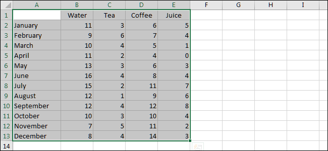
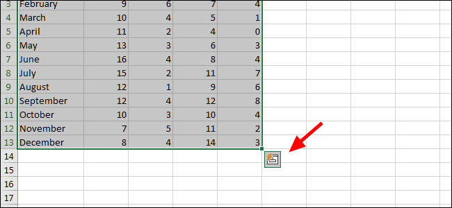
Next, click the small “Quick Analysis” icon. You’ll find it at the bottom right of the selected data.
From the pop-up window, click “Formatting.” This is just one of many analysis types, though it’s a great one to start with for our fictional example.
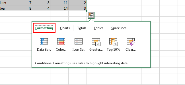
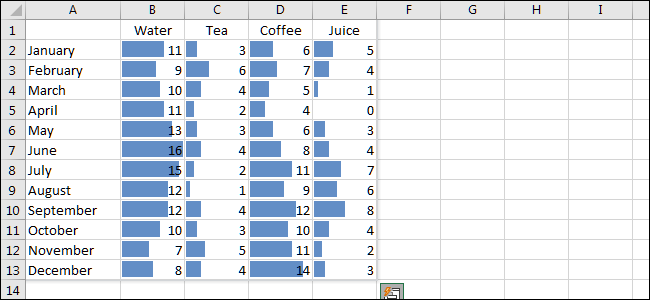
Move the cursor over each option to preview it. Let’s take a closer look at Data Bars.
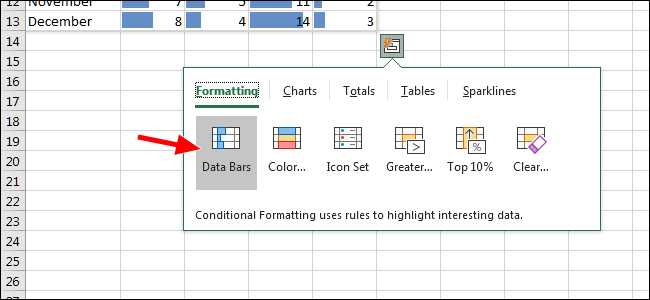
This option, Data Bars, turns each cell into a progress bar. The highest value in our table covers the width of the cell with each additional bar being scaled proportionally.
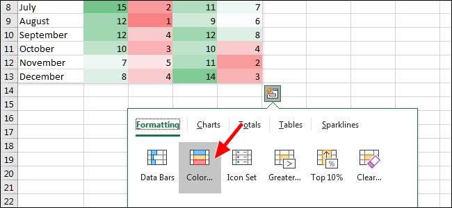
The next visualization, Color Scale, changes each cell’s color according to their value. This is, of course, editable as well if you’d prefer a different color.
The Icon Set option displays an icon next to each cell. These can also be customized to your liking.
![]()
For our use case, we’re going to choose Charts. This will insert a graphic representation of our text-based data.
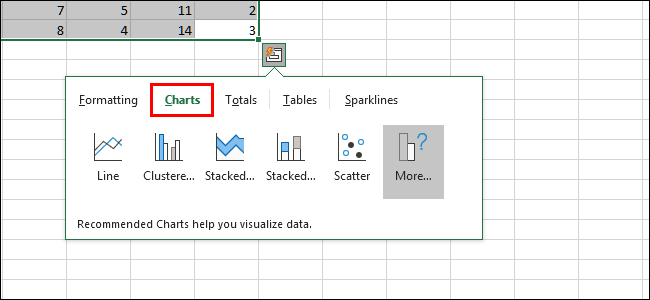
Upon selecting Charts, you’ll see that there are a number of recommendations. You can choose the one that fits your needs best, but we’re going to click Stacked.
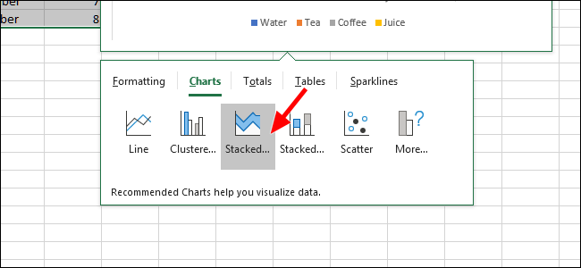
Once the chart has been created, our data is now a graphical representation. We can resize it by dragging the corners.
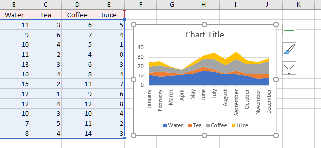
Before we forget, let’s rename the file. To do that, you’ll just double-click the chart name and type in one of your choosing.
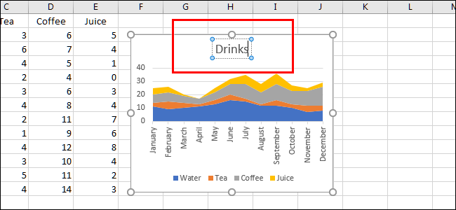
While our chart is almost perfect as it is, let’s change the color of coffee so that it matches the color often associated with it: brown. To do that, we’ll right-click anywhere inside that color area on the chart to bring up some new options.

To pick your color, click “Fill,” then pick your desired swatch.

We could certainly stop here, but what if we wanted to know the total of each type of drink we sold this year? First, we’ll select the data again.

Then, click the Quick Analysis button. This time, we’re going to choose the “Totals” tab, and then select “Sum.”
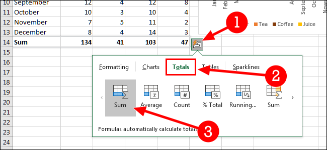
And now, we’ve changed our visualization to include the total of each type of drink sold. Aside from our monthly totals, we now have the sum of all 12 months for each type of drink.
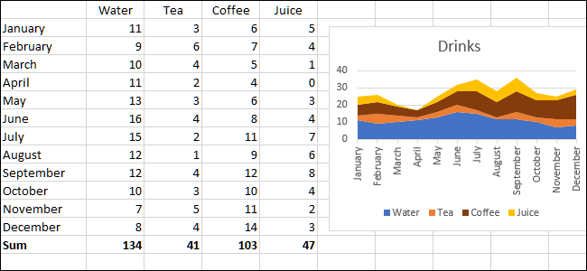
There are a number of ways you can use Excel’s Quick Analysis feature, though this should get you started. It’s definitely a feature best learned by experimenting with different types of visualizations.
Also read:
- [Updated] In 2024, The Ultimate List of Powerful Instagram Hashtags
- [Updated] IOS & Android Tips for Silent YouTube Viewing for 2024
- 2024 Approved Affordable & Reliable Discover the Best Online Passport Photo Apps
- 2024 Approved Unveiling YouTube’s Earnings Blueprint
- A Decade of Reliability: Why This Beloved Android Bot Is My Go-To Tool
- How to Carry Out a Thorough SFC Scan in Windows
- How to Reroute Malwarebytes' Database Access Post Error
- Personalized Scheduling in Outlook for Windows Enthusiasts
- Quell the Public Forum: Strategies for Curtailing Comments in Facebook
- What Does Microsoft Copilot Offer Programmers?
- Windows 10: Steps to Rectify Defective USB Hardware
- Title: Unlocking Insights in Numbers: A Guide to Excel Quick Analysis for Impactful Data Graphs and Charts
- Author: Joseph
- Created at : 2024-10-25 16:13:17
- Updated at : 2024-10-30 16:22:19
- Link: https://windows11.techidaily.com/unlocking-insights-in-numbers-a-guide-to-excel-quick-analysis-for-impactful-data-graphs-and-charts/
- License: This work is licensed under CC BY-NC-SA 4.0.