
Excel Strategies Decoded: Leveraging Pivot Tables to Compute Percent Change Easily

Excel Strategies Decoded: Leveraging Pivot Tables to Compute Percent Change Easily
Quick Links
Pivot Tables are an amazing built-in reporting tool in Excel. While typically used to summarize data with totals, you can also use them to calculate the percentage of change between values. Even better: It is simple to do.
You could use this technique to do all kinds of things—pretty much anywhere you’d like to see how one value compares to another. In this article, we’re going to use the straightforward example of calculating and displaying the percent by which the total sales value changes month by month.
Here’s the sheet we’re going to use.
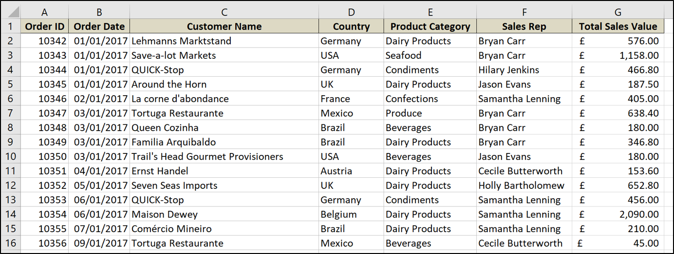
It’s a pretty typical example of a sales sheet that shows the order date, customer name, sales rep, total sales value, and a few other things.
To do all this, we’re first going to format our range of values as a table in Excel and we’re then going to create a Pivot Table to make and display our percentage change calculations.
Formatting the Range as a Table
If your data range is not already formatted as a table, we’d encourage you to do so. Data stored in tables have multiple benefits over data in cell ranges of a worksheet, especially when using PivotTables (read more about the benefits of using tables ).
To format a range as a table, select the range of cells and click Insert > Table.
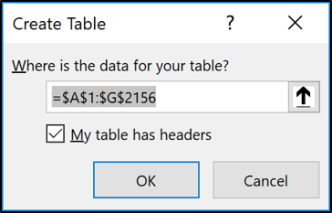
Check that the range is correct, that you do have headers in the first row of that range, and then click “OK.”
The range is now formatted as a table. Naming the table will make it easier to refer to in the future when creating PivotTables, charts, and formulas.
Click the “Design” tab under Table Tools, and enter a name in the box provided at the start of the Ribbon. This table has been named “Sales.”

You can also change the style of the table here if you want.
Create a PivotTable to Display Percentage Change
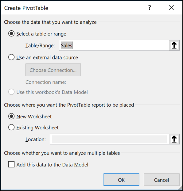
Now let’s get on with creating the PivotTable. From within the new table, click Insert > PivotTable.
The Create PivotTable window appears. It will have automatically detected your table. But you could select the table or range you want to use for the PivotTable at this point.
Group the Dates into Months
We will then drag the date field that we want to group by into the rows area of the PivotTable. In this example, the field is named Order Date.
From Excel 2016 on, date values are automatically grouped into years, quarters and months.
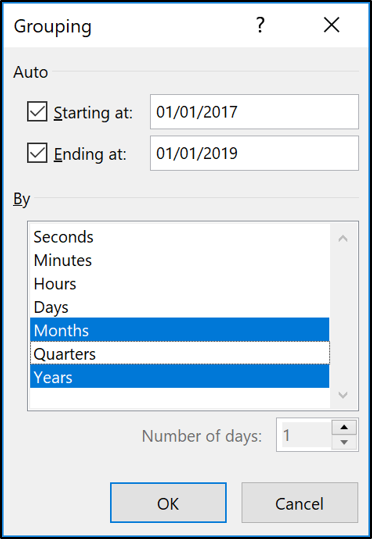
If your version of Excel does not do this, or you simply want to change the grouping, right-click a cell containing a date value and then select the “Group” command.
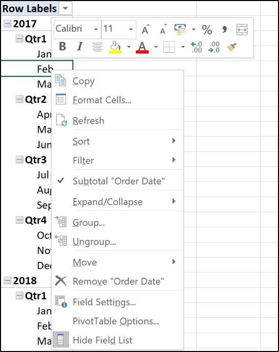
Select the groups you want to use. In this example, only Years and Months are selected.
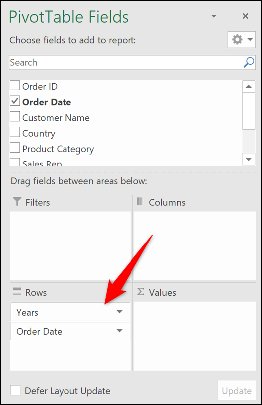
The year and month are now fields which we can use for analysis. The months are still named as Order Date.
Add the Value Fields to the PivotTable
Move the Year field from Rows and into the Filter area. This enables the user to filter the PivotTable for a year, rather than clutter the PivotTable with too much information.
Drag the field containing the values (Total sales Value in this example) you want to calculate and present change into the Values area twice.
It might not look like much yet. But that will change very soon.
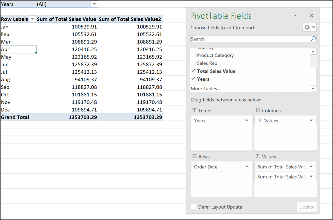
Both value fields will have defaulted to sum and currently have no formatting.
The values in the first column we would like to keep as totals. They do however require formatting.
Right-click on a number in the first column and select “Number Formatting” from the shortcut menu.
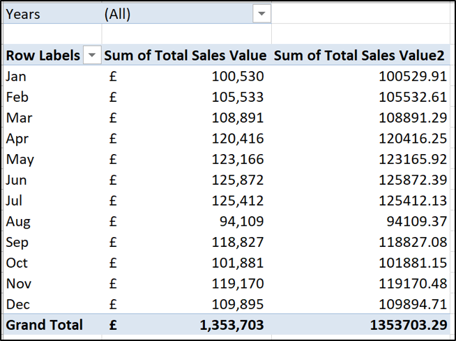
Choose the “Accounting” format with 0 decimals from the Format Cells dialog.
The PivotTable now looks like this:
Create the Percentage Change Column
Right-click on a value in the second column, point to “Show Values,” and then click the “% Difference from” option.
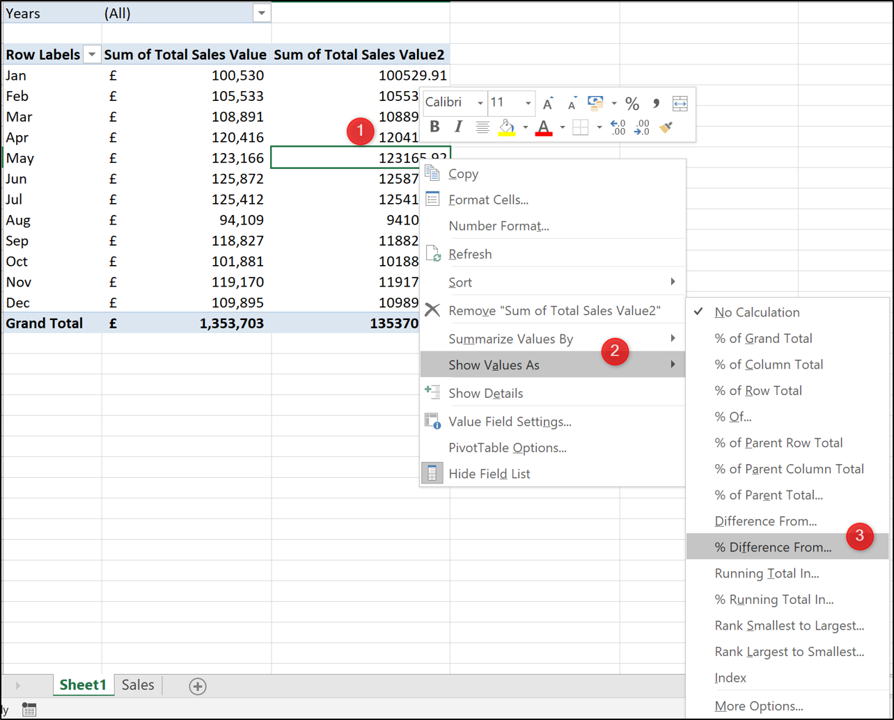
Select “(Previous)” as the Base Item. This means that the current month value is always compared to the previous months (Order Date field) value.

The PivotTable now shows both the values and the percentage change.
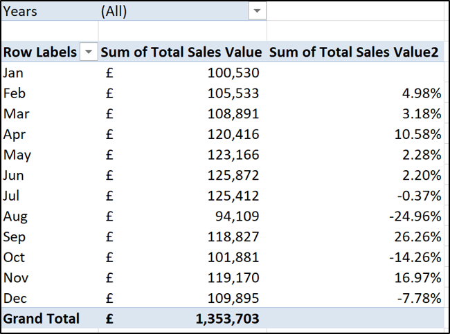
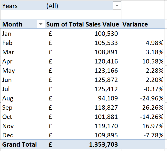
Click in the cell containing Row Labels and type “Month” as the header for that column. Then click in the header cell for the second values column and type “Variance”.
Add Some Variance Arrows
To really polish off this PivotTable, we would like to visualize the percentage change better by adding some green and red arrows.
These will provide us with a lovely way of seeing whether a change has been positive or negative.
Click on any one of the values in the second column and then click Home > Conditional Formatting > New Rule. In the Edit Formatting Rule window that opens, take the following steps:
- Select the “All cells showing “Variance” values for Order Date” option.
- Select “Icon Sets” from the Format Style list.
- Select the red, amber and green triangles from the Icon Style list.
- In the Type column, change the list option to say “Number” instead of Percentage. This will change the Value column to 0’s. Exactly what we want.
![]()
Click “OK” and the Conditional Formatting is applied to the PivotTable.
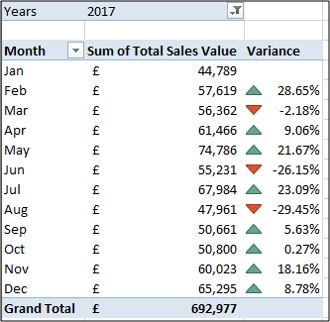
PivotTables are an incredible tool and one of the simplest ways to display the percentage change over time for values.
Also read:
- [New] 2024 Approved The Law of Lyrics on Instagram Platforms
- [New] Step-by-Step Breakdown Hassle-Free iOS Device Recordings
- [New] Webcam & Monitor Recording How to Combine for 2024
- [New] Why Can’t I See Video on Sony A6400?
- [Updated] Best Graphics Cards for 4K Video Editing and Rendering for 2024
- Comprehensive Winxvideo AI Walkthrough: Upgrading and Manipulating Videos with Ease
- Guidance for Overcoming Indexer Service Start-Up Issues
- How to Fix Itel A05s Find My Friends No Location Found? | Dr.fone
- Lock Your Xiaomi Redmi K70 Phone in Style The Top 5 Gesture Lock Screen Apps
- Mastering Windows Menu Management: Quick Fixes
- Navigating Components Settings in Windows 11
- Navigating Through the Forgotten Island Xbox Glitch in Win11
- Reconciling WinRAR's File Sums: A Guide with 6 Fixes
- Reverting Your PC with System Restore: Step-by-Step
- Rooting in Cities Cultivating Urban Biodiversity
- Seamless AI Integration in the Web Sphere
- Strategies for Fixing Apple Device Image I/O Problems in W11
- Title: Excel Strategies Decoded: Leveraging Pivot Tables to Compute Percent Change Easily
- Author: Joseph
- Created at : 2024-10-26 16:50:33
- Updated at : 2024-10-30 17:09:49
- Link: https://windows11.techidaily.com/excel-strategies-decoded-leveraging-pivot-tables-to-compute-percent-change-easily/
- License: This work is licensed under CC BY-NC-SA 4.0.