Enhancing Your Data Visualization: Tutorial on Secondary Axis Management in Excel Charts

Enhancing Your Data Visualization: Tutorial on Secondary Axis Management in Excel Charts
Quick Links
Key Takeaways
You can add a secondary axis in Excel by making your chart a combo chart, enabling the “Secondary Axis” option for a series, and plotting the series in a style different from the primary axis. If you decide to remove the second axis later, simply select it and hit Delete.
If you have a chart where you’re plotting different types of data or the values vary, consider adding a second axis for easier viewing. We’ll show you how to painlessly create a two-axis chart in Excel.
When to Use a Secondary Axis
You may have a mixture of data series with currencies, percentages, decimals, or whole numbers. Or maybe the values you’re displaying vary by greater amounts than the chart can adequately show. In these cases, adding a second vertical axis to the chart can depict the data more effectively.
Related: How to Rename a Data Series in Microsoft Excel
For example, we have our data set including expenses and revenue for our locations. We also have the number of employees for each location to show how those numbers affect the expenses and revenue. This chart has two problems.
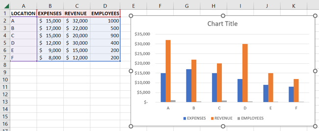
First, the values for the employees are well below the smallest amounts for expenses and revenue. Second, we have a mix of currency and number formats. Not only is the data almost impossible to see, but it’s meaningless without the number values.
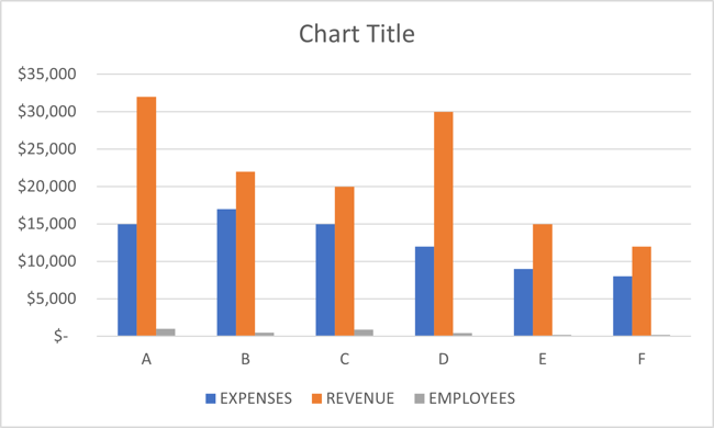
As you can see, plotting this data without a secondary axis doesn’t provide a successful or useful picture.
Add a Secondary Axis in Excel
If you haven’t yet created your chart, you can add the secondary axis immediately by creating a combo chart from the start. But if you already have your chart and simply want to add the second axis to it, you’ll convert your chart, in a sense, to a combo chart.
Related: How to Create a Combo Chart in Excel
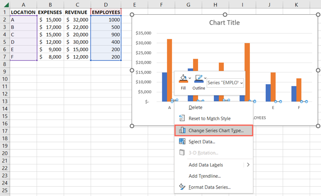
To begin the conversion to a two-axis chart, select one of the indicators for the axis you want to turn into a secondary axis. Then, right-click and pick “Change Series Chart Type.”
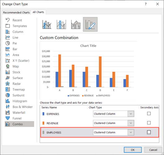
You’ll see the Change Chart Type window open with Combo selected on the left. On the right, you have your current chart type with the data beneath.
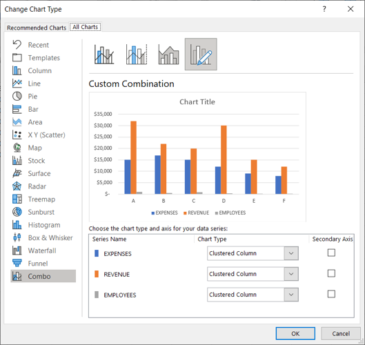
Use the Chart Type drop-down box next to the data series you want to change. Commonly, using a line or line with markers for the second axis works well. However, you can choose another option like area or scatter with lines for a unique appearance if you like.

Then, check the box to the right of the same series for “Secondary Axis.”
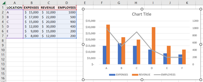
You’ll then see a preview of the updated chart. As you can see, the second axis stands out on its own and also includes the values along the right side. Both of which make the data much easier to understand.

Combo charts normally work with the column chart type. So, you may have to adjust this if you’re using a bubble chart or other kind of graph.
When you finish, click “OK” to apply the change to the chart in your sheet. You can then add axis titles or set up data labels for even more clarity.
Related: 6 Tips for Making Microsoft Excel Charts That Stand Out
Remove a Secondary Axis in Excel
If you decide later that you no longer want a secondary axis in your chart, the way you remove it depends on how you want to display the remaining data.
Remove the Axis and Data From the Chart
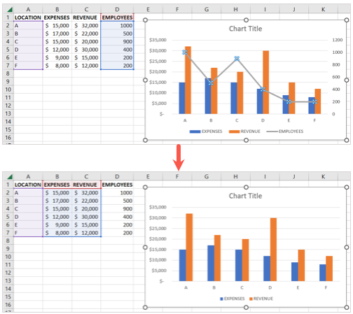
You can remove the axis and corresponding data from your two-axis chart quickly and easily. Select the secondary axis on the chart and press your Delete key.
You’ll then see both removed from the chart.
Convert the Axis to a Different Type
You can keep the data on the chart and change its type just like the example above for converting it to a combo chart.
Right-click the data series and pick “Change Series Chart Type.”
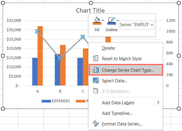
Then, choose the type in the drop-down menu. Be sure to uncheck the box for Secondary Axis. Click “OK” to apply the change.
Convert the Secondary Axis to a Primary Axis
One other option is to turn the secondary axis into a primary axis . Depending on the chart type you’re using for the secondary axis, this might be the ideal option for you.
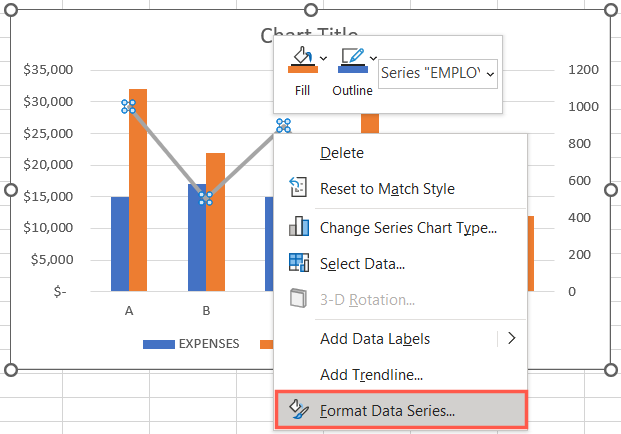
Right-click the data series and pick “Format Data Series.”
When the sidebar opens, select the Primary Axis option in the Series Options section. Note that you should be directed to this exact spot from the shortcut menu.
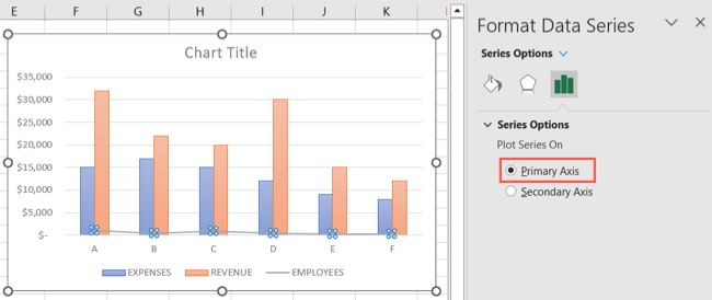
Again, depending on the chart type, you may need to change the style of the axis after you convert it. You can do this by right-clicking, choosing “Change Series Chart Type,” and picking the style as described earlier.
By adding a secondary axis in Excel, you can improve your chart’s readability to make it a more useful visual. For more, look at how to choose a chart to fit your data in Excel .
Also read:
- [New] Precision Window Photography in WinOSes for 2024
- [Updated] 2024 Approved Explore Best 15 Cost-Free Photo Editors
- [Updated] TomTom AdventureCam 2023 A Game-Changer, In 2024
- Catapult Over a Thousand YouTube Audience Members for 2024
- Expert Review of the Portable Aphaca BT69 Bluetooth FM Broadcasting Device for Cars
- How to Overcome Ubisoft Connect Issues Encountered in 2#!!24
- How to Set Active Hours and Avoid Sudden Updates on Windows 11
- Make Your Phone Games Mobile Again: Transitioning to PC/Windows 11 via Google Play
- Pinpoint Customization Techniques for Windows 11 Search
- Resolving Boot-Time Windows Audio Recovery Procedures
- Troubleshooting: Resolving Nvidia CP Access Denied on WS11/10
- Tweak Driver Settings: For Optimal HP LaserJet Pro 400 Printing
- Understanding DISM's Role in Fixing Win11 OS Images
- Updated Blur Unwanted Parts of Your Videos with These Mobile Apps
- Title: Enhancing Your Data Visualization: Tutorial on Secondary Axis Management in Excel Charts
- Author: Joseph
- Created at : 2024-10-25 16:53:49
- Updated at : 2024-10-30 16:40:25
- Link: https://windows11.techidaily.com/enhancing-your-data-visualization-tutorial-on-secondary-axis-management-in-excel-charts/
- License: This work is licensed under CC BY-NC-SA 4.0.